What is the first thing you do when you need to purchase a product or a service? Our guess is that you Google it. Around 87% of all buying decisions begin with online research. Even those who buy products offline research about them and make comparisons before visiting the physical store. So, success for businesses is closely linked to how easily customers can find them when researching online.
Voila! You’ve got a visitor. What now? Given the information explosion on the internet, visitors spend less than 7 seconds to decide whether to continue reading or leave your webpage. How your website performs and its ability to grab visitor attention in these critical 7 seconds depends to a large extent on website design. So, here is a guide to designing a website that has strong SEO (search engine optimization).
Website Designing for SEO
There are many ranking factors that search engines consider when ranking a page. Let’s look at them.
User Experience
How this impacts SEO: A great user experience keeps visitors exploring the site and reduces the bounce rate, which tells search engines that people find your site useful and engaging.
How to Improve User Experience: User experience goes much beyond the look and feel of the website. For a website to be user centric, design decisions should be guided by customer-product interactions. This requires a deep understanding of the target audience and marry their needs with your business goals.
Key Takeaways
Good user experience should communicate with clarity. Here are the Dos and Don’ts to achieve this.
Dont’s
- Cluttered design
- Distracting visuals
- Inconsistencies in design elements
- Unnecessary actions required
Dos
- Website should answer the question “what does the company do?” is less than 5 seconds.
- Narrow your focus to your most important USP.
- Remove unnecessary elements, like social media widgets, sidebar links, pop-ups, floating ads, and auto-loading videos.
- Stick to two colors. If you simply must, then go to 3 colors, but never more than that.
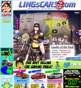
Example of Bad User Experience with High Cognitive Load
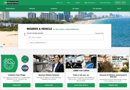
Example of Clean and Clear Website Design
Visual Appeal: A Key Factor Defining User Experience
Although a part of user experience, this deserves a special mention due to its importance in SEO. A clean design that draws attention to the right parts of the website is key to keeping visitors on the page. Sophisticated visuals create a lasting impression and consistency in design elements creates brand identity. These come together to attract more direct traffic.
Best practices to increase visual appeal:
- Selecting a typography that is easy to read and matches the look and feel of your brand.
- Choose a color scheme that reinforces your brand identity and evokes the desired emotions.
- Use white spaces for visual breaks and avoid information overload.
- Use images and videos to make the content more engaging and informative.
- Web textures can be used to combine the physical sensation of touch with sight.
Website Navigation
How this impacts SEO: Your website navigation indicates relevance to search engines, which means that it tells search engines exactly what your site is about and what it includes.
How to Improve Website Navigation: Ensure that your site’s navigation is easy and intuitive. Consider the content hierarchy, or which parts of the site are most relevant to visitors. Make sure the visitor funnels (journey of the visitor through the site) are well defined and clear.
Key Takeaways
Don’ts
- Stuff too many links on your homepage. Search engines assign the maximum authority to your homepage, which then passes this on to interior pages. When your homepage has too many links, the authority being passed on gets diluted for each interior page. Remember, the shorter the top navigation, the higher is the authority flow to the internal pages.
Dos
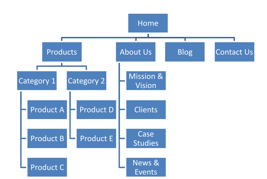
- Begin by creating a flowchart of all the information you wish to share with visitors and club them under different heads.
Example of Website Navigation Flowchart
- Limit the number of menu items in the top navigation to seven.
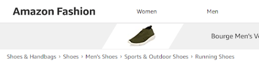
- Use breadcrumbs (hierarchical navigation links at the top of a page) if there are too many internal pages, which is typically the case with ecommerce websites and large content hubs.
Example of Breadcrumbs
- Use the banner to highlight one product or service, as this can be changed frequently.
- Ensure the search function works well.
Calls to Action: A Key Factor in Website Navigation
Effective calls to action (CTAs) enable your website to steer visitors in the right direction and perform the desired actions. Remember that standardized and non-personalized CTAs do not work anymore.
Best practices for effective CTAs:
- Use power words, as this can make your CTA 67.6% more effective. These words elicit emotions. For example, “reveal”, “proves” and “ridiculous” are some words that evoke curiosity.
- Strategically position CTAs according to the buyer’s journey. For instance, at the consideration stage, a CTA like “Start a Free Trial” may work. For more nurtured leads, a CTA like “Buy Now to Get a 10% Discount” may result in higher conversions.
- Use different colors or icons to make your CTAs stand out in your website design. Sleek and prominent CTAs in the visual hierarchy drive more conversions.
- Your customer journey doesn’t end at purchase. They may become repeat buyers or ambassadors of your brand. For them, you may use CTAs like “10% Discount on Recurring Order for 3 Months” or “Leave a Review.”
CTAs at Different Positions During the Buyer’s Journey
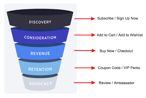
Source: https://www.business2community.com/ecommerce/ecommerce-call-actions-every-part-funnel-01775703
Website Accessibility
How this impacts SEO: Google’s rollout of Core Web Vitals has made inclusive user experience a crucial factor in SEO ranking.
How to Improve Website Accessibility: Focus on website usability and accessibility to design a future-proof website. This means your entire website, including its overall structure, visual content, written content, and page format, needs to be accessible even by the differently abled. For this, you can follow the Web Content Accessibility Guidelines.
Key Takeaways
Dos
- Add proper alt text to images for visitors using screen readers or Braille output devices.
- Use headings properly for non-visual users to understand the structure of the page.
- Create accessible PDFs and use Adobe Acrobat’s PDF Accessibility Checker to know in which areas you can improve accessibility.
- Use contrast between the text and background color to enhance the readability of the text.
- Use voice over in videos for non-visual visitors.
Don’ts
- Use very tiny fonts and overcrowd the text with little white spaces.
- Forget to provide a transcript for the video and audio, so that people who are hearing and/or visually impaired can access the content.
Page Speed
How this impacts SEO: Both Google and Bing consider page loading speed as a ranking factor. Google’s PageSpeed Insights Tool also uses metrics from actual Chrome users, to measure user satisfaction.
How to Improve Page Speed: Good coding is not the only thing that improves page speed. The website’s design can also significantly impact how fast or slowly a page loads.
Key Takeaways
Don’ts
- Use custom web fonts
- Include on-page ads. More than 25% of Americans use ad-blocking technology on their devices.
- Have pop-ups
- Use every plugin that looks interesting.
Dos
- Reuse design elements across the website, since every unique design requires more lines of code, which increases the load time.
- Know the fonts to choose. Arial and Open Sans are among the fastest loading ones.
- Host fonts from a CDN
- Optimize all the images for a balance between size and quality.
- Test the page speed. Then optimize the design and test again.
Responsive Design
How this impacts SEO: In Q1 2021, mobile devices generated 54.8% of global website traffic. Since a large percentage of people surf the net from their smartphones, it is important to get the mobile architecture of your website just right. If your website is not mobile responsive, the bounce rate may be high, adversely impacting its ranking on search engines.
How to Design for the Mobile: Several aspects of a website, including hierarchy of information, fonts used, font sizes, background colors, text colors, and use of animation and videos, differ in a mobile design.
Key Takeaways
Don’ts
- Write a huge amount of text.
- Have a cluttered layout.
- Ask for too many customer inputs. Too many taps and forms to be filled constitute poor user experience.
Dos
- Focus on what’s absolutely necessary, not only from the perspective of your company, but also from the standpoint of user wants and needs. It is key to have a deep understanding of your audience demographics.
- Keep the clean navigation simple. Use the “hamburger” menu. Maintain a consistent and streamlined design and content flow.
- Use images, infographics, and videos to communicate your message without using a great deal of text. After all, videos are expected to make up 82% of all internet traffic by 2022.
- Optimize for mobile connectivity. Mobile page load speed is extremely important. According to Google, 53% visits are abandoned for site that take longer than 3 seconds to load. Number of images, image size, page size and typography play a critical role in determining mobile load time.
Why Visitors Abandon Websites
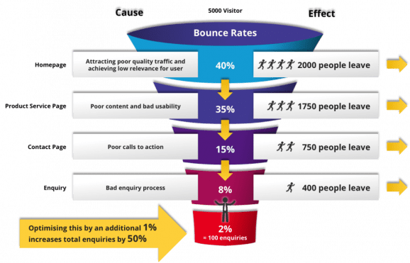
Source: https://2stallions.com/blog/turn-visitors-to-customers-with-conversion-funnels/
Conclusion
Website design plays a key role in creating a seamless user experience across devices and platforms, and this is critical in enhancing brand recognition and recall. While website design is very subjective, there are tried-and-true principles can help make the design more SEO friendly and engaging. Know that creating an SEO-friendly website is a continuous process. It’s something you need to regularly measure and improve. Contact Semgeeks today to discuss your SEO needs!