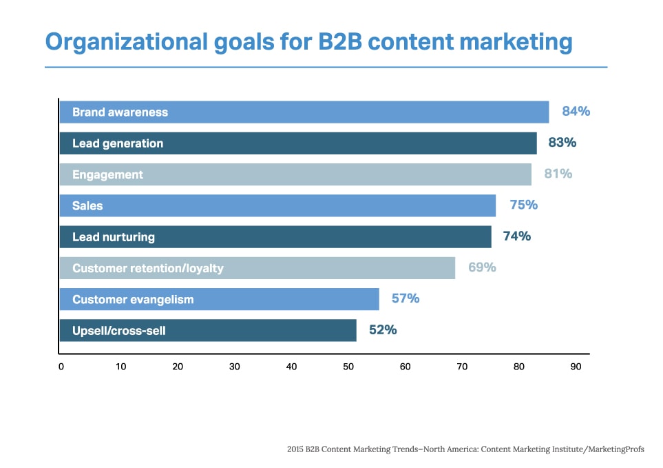
Sales and marketing professionals in the B2B realm are constantly looking for ways to increase their website’s lead generation capabilities. In fact, 83% of B2B marketers engage in content marketing to achieve their lead generation goals.
Whether it is a blog post, whitepaper, toolkit or template, all your content creation efforts are likely driven by one goal: engaging prospective customers with high quality and relevant thought leadership content. The high value resources you create need to be leveraged in your content marketing efforts, through concerted promotional strategies. Getting your prospect to your website, however, constitutes half the battle. An optimized landing page is just the starting point in capturing those valuable leads.
Did you know that landing pages have the highest conversion rates, at 23%? In fact, a HubSpot research report reveals that companies are able to see up to 55% increase in leads when the number of landing pages is increased from 10 to 15.
In short, landing pages could be a linchpin of your B2B lead generation efforts, if done right. So, here are some tips to increase your chances of success.
1. Branding – Consistency in Corporate Logo, Color and Font
To strengthen customer loyalty and brand credibility, your landing pages need to be aligned with your brand image. This includes using the same corporate logo, color combinations, font, language standards and brand voice of the corporate suite. This is important to provide a strong customer experience across channels.
2. CTAs – Include Compelling but not Competing CTAs
Conversational marketing is crucial when it comes to generating and nurturing leads. Users are compelled into action when they are engaged through dialogue-driven activities that promote personalized website experiences.
Does your landing page answer your visitors’ key question of “What’s in it for me?” Establish the top priority action that is in store for users on the page and provide them with clear and actionable CTAs. It would be helpful to provide a high-contrast graphic that supports the CTA.
For each new campaign, however, make sure to craft a unique landing page with a single message, goal, and CTA. Landing pages with multiple competing offers provide 266% fewer leads.
3. Less is More – Be Concise
It could be tempting to stuff each landing page with all the information you have on the offering but try to keep things short and sweet. Stick to only a few key messages in your landing page, just enough to get the buyer curious and asking questions. Research shows that you have only 0 to 8 seconds to capture the reader’s interest with a great headline and landing page.
4. Forms – Simplify the Registration Forms and Test Them
It is a good idea to test various form placements on the landing pages to see what combination works best. Consider placing the form in the header, or at the bottom of the page. Appropriate testing will provide the placement data you’re looking for to validate your efforts, one way or the other.
Also, keep the forms simple. Concentrate your efforts on communicating the benefits of completing the form. A company has been able to increase conversions by 120% by reducing the number of fields in the form from 11 to 4.
5. Videos and Animations – Include a Video
Visuals and animations tend to better engage visitors. Moreover, they can clearly communicate the value proposition of your product or service. Spell check software Ginger increased their conversions by 15% when they added videos to their landing pages. This is another way to add emotional cues and value for your customers.
B2B landing pages are an essential part of the marketing strategy. The design of the pages depends on your target audience, their needs and aspirations, and your brand’s personality. But, the “post-click” experience needs to be focused on as well.
Image Source: http://contentmarketinginstitute.com/wp-content/uploads/2014/10/2015_B2B_Research.pdf

