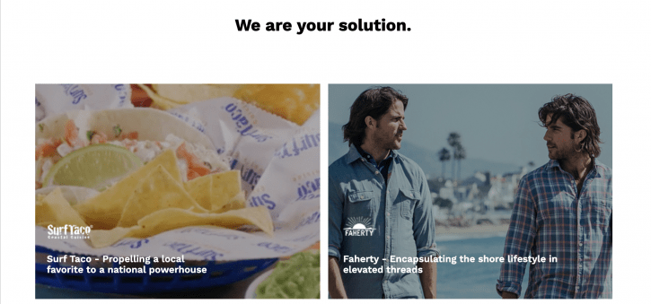
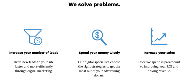
Landing pages are one of the most potent conversion tools that you can use. The main benefit of a landing page is that they can help improve page conversion. But that’s not all. Landing pages can also help you generate data and insights, grow your email list and even improve your brand credibility and awareness. But these can only happen if you have a great landing page. So, here are 4 tips to create a landing page that helps you convert:
1. Have a Great Headline
Research shows the people make up their mind about the traits of a person in as little as 100 milliseconds of seeing a face. These first impressions count for websites as well. So, your landing page should be able to grab the visitor’s attention immediately. That is why having a great headline is important. The headline should be able to compel the reader to stay and learn more about your offerings. But the heading should be short. It is best to keep it below 10 words. In most cases, the headline is complimented by an image that explains the service or product. So, you don’t need to go into too much detail. In short, less in more.
2. Use Visual Content
It is said that a picture is worth a thousand words. This saying is quite true for landing pages. Images, graphics and videos can be more attractive to visitors and even connect emotionally with them. This is because our brain is hardwired for visual content. Our brain processes visual content 60,000 times faster than text. Plus, visual content provides greater retention of information as well. But the visuals must be relevant to the page. You can show the product or service in action. This helps people visualize themselves receiving the benefits of your offerings.
3. Insert Powerful CTAs
The most important element of a high conversion landing page is powerful Calls to Action (CTAs). The only purpose of your landing page is to get people to click on the CTA button. Don’t make the page too cluttered. This might take attention away from the CTA button. Remove any secondary links from the page too, including site navigation. They might take the user away before they can click on the CTA button. Try to make it big and obvious so that the user cannot miss it. Try to write something exciting and persuasive on the button. For instance, instead of just “Submit,” you can use “Click to Get Your Free Marketing Guide.” In terms of color, choose contrasting options. These are more eye catching.
4. Focus on the Value Proposition
Value proposition is basically the service, feature or innovation offered by the company to make it attractive for the customer. Under this, you need to tell the customer how they will benefit by clicking on the CTA button. But don’t pack too much in and make it confusing for the reader. Apart from these, including testimonials and other types of social proof on the landing page can be beneficial as well.
Landing Page Source: https://semgeeks.com/landing/ppc/


